Persistent Pursuit: Katherine Sehr
“The value of art is in the observer,” said artist Agnes Martin. Those who visit the dozen “Untitled” drawings by Katherine Sehr will experience this truth. She calls this group of work Small Obsessions. While her mysterious marks suggest calligraphy and written language, they hang quietly against a pale gray wall without a shout of narrative. Step in closer for an intimate look at the energetic micro-activity within the blocks and columns of varying hues. Colors merge, squiggles and loops weave an urgency found in “hypergraphia” and express a playfulness associated with doodling. The labor-intensive drawing process cannot be rushed. A sense of time and effort infuse her patterns. Akin to intricately bound textiles, there is a trickiness in viewing this work. What dissolves to vagueness from afar, awakens at close range. The artist Paul Klee once commented that “a line is a dot that went for a walk.“ Sehr’s line is a bit like a frisky dog who leaps and tumbles along the way—a line with no beginning and no end.
Visitors to art venues may be accustomed to observing installations of conceptually demanding work that is abundant in materials, story, and idea. Small Obsessions is quite the opposite. The artist’s renderings of infinite space are created with traditional materials—papers and pens. She favors Gelly Roll scrapbooking pens in jewel and earth tones. Her refined drawing process refers back to an artistic lineage that includes the abstract calligraphy of Mark Toby and color field painting of Mark Rothko.
After attending the University of Buffalo, Sehr received an MFA from the Art Institute of Chicago. She has exhibited extensively in recent years and is now one of five artists selected for a yearlong residency at the Western New York Book Arts Center made possible by the New York State Council on the Arts. The show is accompanied by an exhibition brochure and commentary by Burchfield Penney Art Center Chief Curator and Associate Director Scott Propeack.
Ancient wisdom of the Tao tells us: “Where the Mystery is the deepest is the gate of all that is subtle and wonderful.” Influenced by Chinese art and Taoism since visiting the country as a teen, Sehr told an interviewer on the Lemon Hound website that her drawing process has a calming effect on her. That calm is clearly extended to the viewer who spends time with this work. The exhibition is on view through March 13
– Pat Pendleton, The Public
Forward for Small Obsessions
Katie Sehr creates work that has an allure which is not immediately easy to understand. Drawing with a complexity that shares a kinship to an object reality more emotionally connected to painting or sculpture.
Drawing is wonderful, like a solo in a musical composition – paired down with no space to hide – the line is naked. In juxtaposition to the orchestral reality of painting in which a completely covered surface allows the occasional stray stroke to hide. Sehr’s work occupies the space with the sensibility and full lushness that one associates with painting, but doesn’t provide itself with an exit option of layered hideouts.
Space or where the line is not creates an optical depth that normally is tangible with sculpture – providing a dimensionality. Our eyes move around finding pockets and mounds, but not the parlor trick of op art. Just as we find and define these spaces we are not able to escape the lines that provide their definition and then return to them as a track to follow.
On the pathway of the line, where does it start and finish, we try to keep up with or understand the code. At a point when we feel our most overwhelmed, getting to the ground of what we are experiencing, our mental agility tested, we reside in the place where the complete feeling resides. Arrival at an emotional space that is the liminal, neither here nor there, but is ours and shared with the artist. Being occupied by this moment of understanding we are presumably safe in what we see. It is at that moment, when most comfortable, our mind starts to notice the variation of density of the mark making and we return again, happily.
-Scott Propeack, Associate Director / Chief Curator at Burchfield Penney Art Center, Buffalo, NY
ECHO ART FAIR MENTION
While local artists’ booths did contain some strong work — intricate abstract patterned pen drawings by artist Katie Sehr were a standout — the most memorable booths were largely those of Canadian galleries.
– Julia Halperin, ARTINFO
The Huffington Post
Katherine Sehr: The Linear Truth
Sehr, whose work has transfixed local art connoisseurs for years, belongs to a particular and fascinating subset of artists who seem driven by some elemental compulsion to make their work. Her paper drawings contain nothing but intricate scribbles, set down in intricate patterns that take time to complete. Her work is as much about the final product – which in this show is as beautiful as you might hope – as it is about the obsessive and poetic process of its creation. The pieces are records of the time and thought Sehr poured into them, self-contained narratives of frenetic effort and energy written in a secret script.
Unlike some of Sehr’s recent work that’s been on view in the Burchfield Penney Art Center and elsewhere, the pieces in Nina Freudenheim’s space are smaller and less imposing. While they lack the overwhelming qualities of her larger projects, they are equally impressive aesthetically. Her work is playful in the way Keith Haring’s work is playful – something to do with the rounded edges of lines and the way they seem on the verge of becoming letters or symbols – but peculiarly studied in a way that belongs exclusively to Sehr.
In some of her new drawings, Sehr uses two colors adjacent to one another on the color wheel. Little tendrils of blue or maroon extend up or down into seas of green or purple like little strands of DNA, revealing the surprisingly freehand nature of her drawing process.
This lovely, intoxicating work begs the viewer to peer closely into it as one might peer up into the night sky, and to contemplate the unique talent that created it.
Colin Dabkowski, The Buffalo News 2013
Beyond/In Western New York, 2007, ARTVOICE REVIEW, BUffalo NY
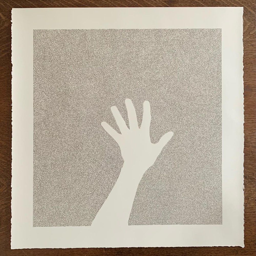
Seen from the front door of the Carnegie Art Center, Katherine Sehr’s drawings don’t look like drawings at all, but rather like prints of simple, paired squares of muted colors. Upon closer inspection, however, they reveal themselves to be something entirely different—large, frenetic, scribbled testaments to compulsive, repetitive motion. Sehr’s freehand squiggles are amazingly uniform in pattern, seemingly without variety despite the large scale of the pieces. The effect is one of controlled chaos, an electric, jangling convolution, framed and strengthened by perfect squares, which are entirely filled but never transgressed. Of particular interest is one piece in which Sehr unmasks her method, leaving one of two squares largely unfinished, a few tendrils of her curling tremors wisping suggestively into negative space. In fact, what you see in Sehr’s pieces is mostly space—like the space in and between the atoms that comprise our bodies and all of the objects around us—but it is the smaller something that is alive, that informs, defines and dominates, until the larger void is nearly beyond perception
– Becky Moda, Artvoice, 2007
FORWARD FOR BEYOND/IN WNY 2007
In the large-scale drawings of Katie Sehr, extreme conglomerations of the tiniest, repetitive gestures cluster together to create a unique and unexpected universe. Sehr’s intricately patterned works are deceptively simple. There is an undeniable manic-obsessive process behind her freehand drawings, realized without the aid of a prototype or stencil. Coupled with the sheer volume of drawing activity before us, this obsessive act is an unerring ode to commitment and artistic persistence – to hold fast to a methodology and see it through to its logical and unanticipated conclusion. The works also double as performative documents, clear evidence of a relentless, artistic drama, which is not merely the final realization of a complicated drawing but also an exploration of the implications of such an intense process. Depending on the color, the works can appear serene or bustling with internal energy. If a pale ink languidly pulls us into a placid visual field, a more vibrant ink yanks us in and bounces us around. Meanwhile, the overall effect of the work is illusory at times, confounding the eye with the simple, delirious visual pleasure derived from unexpected effects. A natural progression from Sehr’s earlier works (variations of the grid), these newer drawings dismantle the grid and reassemble its form as an aggregate of singular lines and smaller shapes. In Sehr’s work, the most diminutive marks ultimately create and define their own enormous space, with its own set of implications and possibilities.
-Carnegie Art Center Director, Ellen Ryan, 2007
Buffalo Spree Magazine
Katherine Sehr’s most recent-and most interesting-work has been incredibly subtle and delicate ink on paper drawings. The work looks inward, quietly pulling the viewer toward it; it is a light filled enjoyable experience.
-Elizabeth Licata, Buffalo Spree Magazine, 2008
Review
Artist Katherine Sehr’s ink on paper drawings were featured at the Nina Freudenheim Gallery back in 2008 and what a pleasure it was! The gallery, located on the first floor of the historic Hotel Lenox, exuded a sophistication very reminiscent of a chic uptown Manhattan space lending itself very well to the selections showcased in this particular show aptly entitled “PAPER THIN WALLS”. While many of Sehr’s drawings were of large scale, the cozy gallery (with its subdued architectural details, hardwood floors, high ceilings, track lighting and city view) proved itself to be deceivingly adequate for Sehr’s substantial pieces. The informal elegance of the space allowed Sehr’s work to simply shine as the pieces flowed from room to room effortlessly. Overall the stylish clean lines of the gallery with its upscale (but not elitist) grace complimented the classy simplicity of the artwork quite nicely.
As for the content of the art itself, agreeably so, one could have read the rhythm of the freehand lines covering the picture plane as manic or obsessive. However, upon closer inspection, the delicate markings illustrated a sense of mesmerizing movement revealing an underlying strength despite its superficial fragility. Not to mention the fact that the dimensions of the pieces, while commanding, were softened by the artists deliberate color palette selection of beautiful soft hues which served to add a dreamlike quality to the drawings. A wise decision that rendered the ink drawings strangely restful in spite of their congested compositions. The controlled landscapes would not have been as approachable if every element of the pieces (scale, subject, composition and color) were blaringly anxious or randomly chaotic. No doubt the artist took this into account when she decided to go with a soothing palette. By and large, the gallery space and the exhibition as a whole were well thought out and very well executed. Future collaborations with these two are sure to be a success. Many kudos to both Nina Freudenheim and Katherine Sehr for a show done with gran élan.
~ Desirée Crúz-Nevilles, 2009
The Buffalo News
On the walls, a number of pen-on-paper pieces by Katherine Sehr hang, tempting viewers to put their noses up to the paper to inspect the meticulous patterns Sehr has rendered. Viewed from afar, the pieces look like pastel blocks of color or shades of gray. This sense of coherence breaks down into a series of meticulous pen-strokes the closer you get. These pieces are documents of the long hours Sehr spends drawing in her studio, and also of the strange nature of human obsession.
-The Buffalo News, 2011
Artvoice
“Let there be spaces in togetherness,” wrote Kahlil Gilbran.
Overlooking the Delta Sonic petrol plaza, Katie Sehr’s studio apartment is a quiet cloister of understated furnishing and family antique heirlooms. An artist in her early 30s, Sehr studied with David Scherm and graduated magna cum laude with a BFA in painting from UB in 2000. She took her MFA in print media from the School of the Art Institute of Chicago in 2005.
Having been brought up “in the woods” along the upper Hudson Valley, she often went to nearby Storm King Sculpture Park, where she came to admire the outdoor works of Richard Serra and David Smith. Later at the Chicago Art Institute, personal circumstances triggered an episode of manic depression that prompted a propensity for drawing repetitive strokes. “Hypergraphia,” a condition that is expressed by a driving compulsion to write or draw repetitively, is often associated with mania in the context of bi-polar disorder. Working in printmaking in Chicago, she gradually found a truer measure of her creative energy in drawing directly on paper. Her mentor there told her to forget printmaking and “keep drawing.” Earlier influences included Mark Toby, Agnes Martin, Ad Rinehart, and Veja Celmins—all major artists in the minute mysteries of the refined mark.
Sehr’s work space, her apartment floor between a big brass bed and kitchen, belies the scale of her drawings. On her knees, cushioned by a small throw pillow, she leans over large sheets of decal-edged paper. Using a series of metallic jelly pens, she addresses the blank rectangle, drawing, within a ruled-off perimeter, a miniscule tissue grid of interlocking, angular/curving, glyphic-like deposits of ink that give the impression at a distance of sand, fabric, or screen mesh, creating a finely detailed surface that invites close inspection. The process is additive, one character form building to the next in a continuous expanse fluctuating through minute variations in detail. This overall design holds the ground solidly but allows the work to breathe through its pin-dot negative spaces at the interstice of each grapheme. Over the course of many sessions, amid the dust and errant hair of her apartment, Sehr draws meticulous, labyrinth-like compositions that become gossamer vails of color—pale when the pen runs near dry, strongly pigmented where the pen is new.
In her work Katie Sehr has channeled a therapeutic journey from psychological dysfunction into art fully wrought in elegant ligatures of meditative grace.
Sehr will be featured in an exhibition at the Burchfield Penny Art Center titled Overabundance of Detail from February 12 to July 3, 2011.
—j. tim raymond, Artvoice 2011
Linear Truth
While reading the Japanese writer Junichiro Tanizaki’s novel Some Prefer Nettles, I came across the line, “tightly woven in small subdued patterns, magnified heavy and stiff, as strands of chain.” He was speaking about fabric— the crepe and silk brocade of a geisha’s kimono. It reminded me of viewing Katherine Sehr’s “acts of drawing” at Nina Freudenheim Gallery.
Carefully over the last decade Sehr has developed her carpet-like graphemes of delineated twists and whorls into essentially a schema filling any given ruled-off perimeter. Her current exhibition, Linear Truth, perhaps hints at a turning point in the artist’s maturing development. Here again the artist’s compositions on paper, her pen limned tensions and undulations in minute variations of color and density, coalesce in an all-over cellular grid of mass and voids, often producing a sublime monumentality.
At the same time the formal challenges of her art-making process risk creating work verging on a fugue-state of predictability. In her artist’s statement she describes “an accumulation of psychological traces,” which I read as the glyphic residue of a practiced meditative therapy. There is certainly evidence of intense mental vigor behind her best work…but it is difficult not to imagine her becoming something like a machine as she kneels above her paper, meticulously spooling out each puzzling extrusion, then linking them growing over time into a skein of additive ligatures. Her notion of mapping time through an organic process brings to mind the instinctual work of bees building a hive, the foliate interface of lichen growth, the minute skeletal accretions that build a coral reef. Her merging cursive arabesques recall the “renovatio” of Persian-derived ornamentation in early medieval basilica mosaics, door panels and textural illuminations…intimating the meditative, contemplative iterations prayerfully meant to inspire a state of calm and grace.
Sehr’s show at the Nina Freudenheim Gallery runs through July 26th.
—j. tim raymond, Artvoice 2013